
The Bunnings Workshop community can help with your home improvement projects.
- Bunnings Workshop
- >
- Discussion
- >
- Whole of House
- >
- Re: Help! My walls look blue
Help! My walls look blue
- Subscribe to RSS Feed
- Mark Topic as New
- Mark Topic as Read
- Float this Topic for Current User
- Bookmark
- Subscribe
- Mute
- Printer Friendly Page
Share
- Mark as New
- Bookmark
- Subscribe
- Mute
- Subscribe to RSS Feed
- Highlight
- Report Inappropriate Content
Help! My walls look blue
I have painted a couple of rooms in my house using Dulux Wash and Wear – Lexicon (full strength). Once the 2 coats dried, my rooms have come up looking blue in certain lights and especially against the white ceilings.
I wanted a white that had a tinge of grey in it, which is what the sample card looked like. Not blue. Was thinking of using Lexicon quarter instead but I’m still worried that blue will come through.
Does anyone else have experience of their walls looking blue? Or using the Lexicon colour?
- Mark as New
- Bookmark
- Subscribe
- Mute
- Subscribe to RSS Feed
- Highlight
- Report Inappropriate Content
Re: Help! My walls look blue
Welcome to the Bunnings Workshop community @BazPraz.
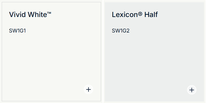
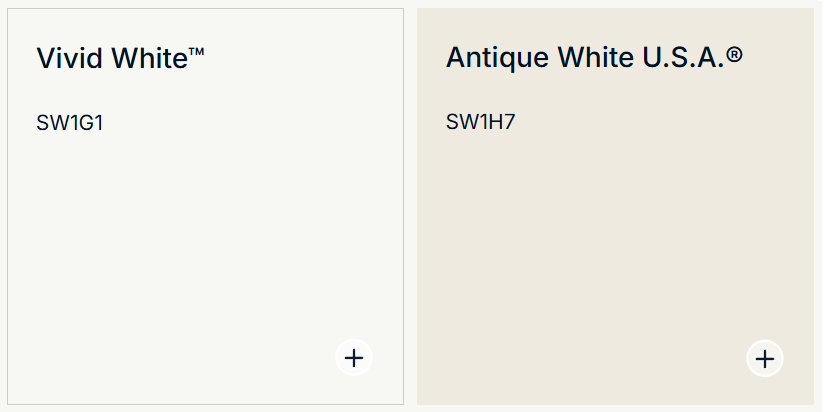
I'm sorry to hear the colour hasn't worked out for you, especially after going to the effort of painting the whole house. The blue portion of the tints will certainly stand out if placed next to a vivid white ceiling. I ran into a similar issue when I chose Antique White USA for my walls. It looks super white by itself, but when put on walls that have a vivid white ceiling, it almost looks like a cream colour. IN your case, the blue sub-tones are brought out, and in mine, the ochre warm tones are amplified.
You'll find that painting the ceiling and cornice in Lexicon half will reduce the impact to a certain extent. I've added a colour cube, which I use to explain how colours react with those around them. The brown square on the top is the same colour as the "orange" one on the front; it's just that the colours and shading around it make it look orange.
You might like to try painting the ceiling in one room in Lex half, to see if that could be a move forward.
I do apologise for the inconvenience. Please let me know if you have any questions.
Mitchell

- « Previous
- Next »
Why join the Bunnings Workshop community?
Workshop is a friendly place to learn, get ideas and find inspiration for your home improvement projects
You might also like


We would love to help with your project.
Join the Bunnings Workshop community today to ask questions and get advice.