
The Bunnings Workshop community can help with your home improvement projects.
- Bunnings Workshop
- >
- Discussion
- >
- Whole of House
- >
- Re: How to improve commercial take away ...
How to improve commercial take away shop fit out?
- Subscribe to RSS Feed
- Mark Topic as New
- Mark Topic as Read
- Float this Topic for Current User
- Bookmark
- Subscribe
- Mute
- Printer Friendly Page
Share
- Mark as New
- Bookmark
- Subscribe
- Mute
- Subscribe to RSS Feed
- Highlight
- Report Inappropriate Content
How to improve commercial take away shop fit out?
Note to moderators: Please do let me know if this post goes against the Workshop guidelines, as the post is related to a commercial site and not residential, which may be an issue.
Hope everyone is going well!
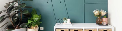
We currently run our own little Indian Takeaway shop in the heart of St. Kilda. We have had the same shop look and layout for about 7 years now, and thought it's about time that we make a few changes to make the shop look more modern and appealing. But before we went ahead with making any changes, we thought to hop onto the Workshop to see if you guys may have some suggestions on what we could possibly change. We aren't looking to do a full renovation, but more so just minor budget friendly changes which will help with the look of the shop. For example, in the photos attached, in the red boxes, are two boards which display newspaper articles. We were looking to change these boards to something more modern, like a modern board, where the articles can be displayed on. Further, in one of the photos is a blue box highlighting the wall. We were thinking to remove the picture of the flowers, because that doesn't add much to an Indian takeaway shop and somehow utilize that whole wall in the blue box in a more creative way.
This is our first time where we will be doing something like this, so we are a little lost with regards to ideas/designs and what materials to use etc. Therefore, we would greatly appreciate any suggestions here for us to source ideas and inspiration from.
Thank you!


- Mark as New
- Bookmark
- Subscribe
- Mute
- Subscribe to RSS Feed
- Highlight
- Report Inappropriate Content
Re: How to improve commercial take away shop fit out?
Hi @prvz27,
I'd suggest removing everything off the walls that are not essential to the running of the business. If those two colours are iconic to the business, then I would encourage you to stick with them but perhaps find a yellow that is slightly more vibrant. Since the colours are so prominent already, it would be worth continuing with that theme and either painting the roof in yellow and/or the floor in green. Make a real theme of it.
You could use the Bellessi Motiv glass panels beneath the bench top as they have some really eye-catching designs. You can write on these glass panels with certain markers designed for glass. If you placed one of them where the blue square is then you could create a really interesting feature. You could write up the specials of the week in bright colours or have a wall where customers could write or doodle while they wait.
I'd be interested to hear if @Tara86, @prettyliving or @redracer01 had any suggestions for you.
Mitchell

- Mark as New
- Bookmark
- Subscribe
- Mute
- Subscribe to RSS Feed
- Highlight
- Report Inappropriate Content
Re: How to improve commercial take away shop fit out?

Hi @prvz27
For the wall with the flower picture you could always turn it into a symmetrical photo gallery wall, maybe like 6 or 9 square frames depending how many you can fit there, and then display pictures of the food in them?
- Mark as New
- Bookmark
- Subscribe
- Mute
- Subscribe to RSS Feed
- Highlight
- Report Inappropriate Content
Re: How to improve commercial take away shop fit out?
Hello @prvz27
If I may suggest the following.
Yes, I agree to remove the old cork boards that have notices from long ago, they serve no useful purpose. Yes, remove the old flower frame and old food pictures that have no information on them. If notices and information need to be displayed put it on an A frame so its easy to display outside and is easy to move around but not on the doors. Having so many stickers on your door becomes confusing and people generally ignore them and not read them at all. The menus on the glass panels do you no favors, it blocks the view and does not make the place look appealing. You want people to see inside and see that there are tables available and that they can order take away. Lets do it in list form :
1. Get new menus with pictures and prices. It makes it easier for the customer to choose and not guess what they are ordering.
2. Remove all the old display posters on the glass windows, If you wish to have new posters invest in a professional artist who can create you a new poster that displays your best and popular dishes.Use glass hooks with suction cups so that you don't need to use sticky tape on glass.
3. Time for new paint, looking at the wall near the kitchen you can clearly see that it has turned yellow brown due to the intense heat of your cookers and has changed the color of the wall. You can stay with your original colors, it just needs to be new and fresh.
4. The box shelves that are holding the wine at the front counter makes the front look crowded and boxed in. I suggest making a new shelf at the back wall near the air-con unit to display the wine. Remove the box shelving and improve flow and ambiance.
5. Place the beer bottle shelf display under the wine shelf display. It makes it easier for your patrons to choose drinks after they have chosen their food.
6. Remove your giant NULLFAUR menu it is confusing and is hard to read. I suggest a new condensed menu at the bottom of the air-con unit with bigger letters and a more concise food list. Making the list shorter makes it easier for the customer to choose and does not overwhelm them with choice.
7. I know that it is seasonal but I suggest some Christmas light self adhesive clips to straighten out your Christmas light display.
8. Use cable straps to tidy up all electrical cable. Not only does it make it look tidy but prevents your store looking like a fire hazard.
9. I know red is the color of appetite but it is also hard to read in clear glass. I suggest white or bright yellow lettering on your glass windows, it is easier to read in glass and can be seen even from afar.
10. Have your permits and licenses displayed in a frame in one area easy to see and can be seen by the council quickly come inspection time. Council notices for under 18 and intoxication can be displayed underneath next to your licenses.
11. Perhaps new collared shirt uniforms for your staff in yellow and green? gives them that team member look. Yes?
These are all cosmetic suggestions and easy to implement. A little expense on the paint, menu, posters and shelves perhaps but nothing major. Keeping your customers surprised that you have renovated gives them the impression that you care about your shop and you care about your customers. I hope these suggestions help. If you have any more questions please drop us a line here on Bunnings Workshop.
Cheers,
Red
I am a Bunnings team member. Any opinions or recommendations shared here are my own and do not necessarily represent those of Bunnings. Visit the Bunnings website for assistance from the customer service team.
- Mark as New
- Bookmark
- Subscribe
- Mute
- Subscribe to RSS Feed
- Highlight
- Report Inappropriate Content
Re: How to improve commercial take away shop fit out?
Thanks a lot for the suggestion @MitchellMc !
I didn't realize that my replies didn't go through initially, hence the very late response here!
We didn't end up using these for the shop, but we will purchase these for the home, great idea for the kids to write and draw on.
- Mark as New
- Bookmark
- Subscribe
- Mute
- Subscribe to RSS Feed
- Highlight
- Report Inappropriate Content
Re: How to improve commercial take away shop fit out?
Hi @prvz27,
Have you made any changes to the shop as yet? I trust our members will be eager to see the improvements you've made.
Please keep us updated and let us know if you need further assistance.
Mitchell
- Mark as New
- Bookmark
- Subscribe
- Mute
- Subscribe to RSS Feed
- Highlight
- Report Inappropriate Content
Re: How to improve commercial take away shop fit out?
Thank you so much for the informative suggestions !
We read through all of them and went ahead to implement suggestions 1, 2, 3, 7, 8 and 10.
Suggestion 11 (S11) - Yes, we are considering this so the uniform matches the store look.
S9 - Will definately change this to a yellow colour, as like you said it will stand out and be easier to read, as well as match the interior colour.
S6 - We have thought about what to do with this board. When customers come in they always look at that board, it does attract attention. However, it can definitely be simplified and less overwhelming. We are thinking to have a few small boards which will guide the customer on how to order. E.g "Step 1 - Choose your curry', "Step 2 - Choose your rice/bread", "Step 3 - Choose a dessert". Something similar to that. It will be much more helpful to customers as many customers do get confused on how to order Indian food.
S4 & 5 - Down the track in the future we will tackle the structural parts of the shop, this is part of the plan. Thanks for suggesting.
Why join the Bunnings Workshop community?
Workshop is a friendly place to learn, get ideas and find inspiration for your home improvement projects
You might also like


We would love to help with your project.
Join the Bunnings Workshop community today to ask questions and get advice.